
ES
ONU Habitat y el Ayuntamiento de Madrid celebraron, a finales de 2016, el el Encuentro Internacional “Una nueva Justicia para la Nueva Agenda Urbana”. Una reunión que tiene como objetivo promover el debate y generar e intercambiar conocimientos sobre la relación entre la justicia espacial y la ciudad para que sus conclusiones sirvan de aporte al proceso de discusión y futura implementación de la Nueva Agenda Urbana que será aprobada en la Tercera Conferencia de las Naciones Unidas sobre Vivienda y Desarrollo Urbano Sostenible (HABITAT III).
Así, desde Aleph Comunicación me encargaron realizar la identidad visual que acompañaría a las diferentes sesiones el encuentro. El objetivo era crear una imagen que respetase las guidelines de ONU-HABITAT y representase una reflexión sobre la relevancia de la dimensión del espacio urbano en el camino para alcanzar la justicia social, ahondando en conceptos clave como equidad, diversidad, ciudadanía, colectividad, sostenibilidad, inclusión o seguridad.
EN
UN Habitat and Madrid City Council have celebrated, at the end of 2016, an international meeting called «A New Justice for the New Urban Agenda». Its main goal is discuss and exchange knowledge about the relationship between territorial justice and city enviroment in order to get conclusions and though use these to implement them on the New Urban Agenda that was approved at the Third United Nations Conference on Housing and Sustainable Urban Development (Habitat III).
Therefore, aleph communication put me on charge of the visual identity development which was exibited during the meeting. The aim was creating a visual interpretation that follows the UN Habitat guidelines, symbolise a reflection about the relevance of territorial space in the way to achieve social justice, delving into key concepts such as equality, diversity, citizenship, community, sustainability or security.

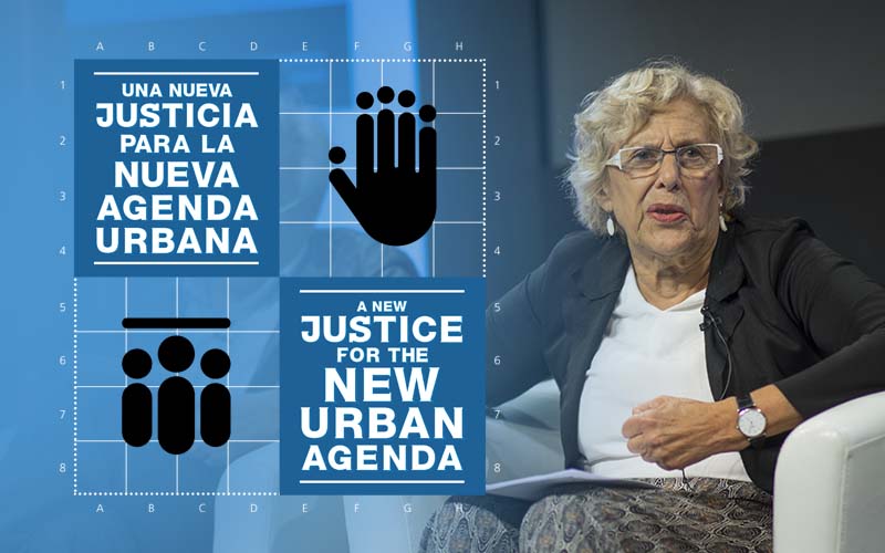
El concepto creado es completamente simétrico, lo que permite contar con espacios idénticos para que, como pedía el cliente, se pueda mostrar la información en español e inglés. La información está expresada de la manera más simple posible y los caracteres de la fecha del evento se han minimizado para que el conjunto sea comprensible en ambos idiomas, sin necesidad de crear un cartel específico para cada uno.
A fin de acercarlo más la planificación urbana y arquitectura, la imagen principal se encuentra en una cuadrícula de 64 espacios que imita a un plano urbano. Esto permite crear un espacio exactamente igual para acoger a cada ciudadano y enfatiza la idea de equilibrio e igualdad. Además, para destacar a Madrid como la ciudad-sede del encuentro internacional, se ha utilizado el Mantua Carpetatorum sive Matritum Urbs Regia (Madrid Ciudad Regia) de fondo, un plano de la capital creado por el cartógrafo portugués Pedro Teixeira Albernaz, por encargo de Felipe IV, en 1656.
The information is show up on a very simplest way, shorten the event date line, making it understandable and useful for both English and Spanish languages, as requested by the client. The information is expressed in the simplest possible way and the characters of the event date have been minimized so that the set is comprehensible in both languages, without the need to create a specific poster for each one.
In order to bring it closer to urban planning and architecture, the main image is in a grid of 64 spaces that imitates an urban plan. This allows to create an exactly equal space to accommodate each citizen and emphasizes the idea of balance and equality. In addition, to highlight Madrid as the host city of the international meeting, I’ve used the Mantua Carpetatorum sive Matritum Urbs Regia (Madrid Ciudad Regia), a map of the Spanish capital created by the Portuguese cartographer Pedro Teixeira Albernaz, on behalf of Philip IV, in 1656.

Para que el evento disponga de una personalidad propia, se ha desarrollado una tipografía propia, de trazos gruesos y que otorga gran legibilidad al diseño, así como dos iconos que profundizan en la temática del encuentro:
- Icono 1: Una mano levantada que simboliza el derecho a expresar una opinión de manera ordenada y educada. Sobre cada dedo existe un círculo, figura necesaria para iconizar a una persona. Así, el conjunto representa a distintas personas, de distintas alturas y formas (tan similares pero tan distintas, como lo son entre sí los dedos de una mano o los habitantes de una ciudad), aportando su opinión o punto de vista al tema que acontece.
- Icono 2: Presenta a tres personas cobijadas bajo un techo plano, que simboliza el acceso a una ciudad justa, bien planteada e igualitaria, que acoge a todos los ciudadanos sin importar cómo son (etnia, clase social o sexo).
In other hand, giving the event a particular personality I have developed a type, with thick strokes and that gives great readability to the design, as well as two icons that deepen the theme of the meeting:
- Icon 1: A raised hand symbolizing the right to express an opinion in an orderly and educated way. A circle shape placed on top of each finger referring to different people as their own differences (so similar but so different, as are the fingers of a hand or the inhabitants of a city), giving their opinion or point of view.
- Icon 2: Presents three people under a flat roof, symbolizing access to a fair, well-set and egalitarian city, which welcomes all citizens no matter what they are (ethnicity, social class or sex).

Los días del evento, me encargué de filmar y fotografiar cada ponencia organizada. Material que se reunió en un vídeo-resumen del encuentro:
Although, I was in charge on the filming and photo shooting of the entire event. Here I leave a video summary and some captures of the day.